
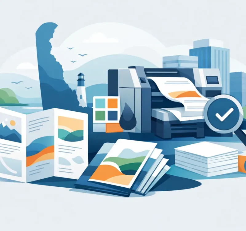
A customer walks out of your office, leaves your table at a community event, or picks up information at your retail counter. What do they take with them? For many local organizations, brochure printing Delaware businesses can count on turns a quick conversation into a useful reminder of who you are, what you do, and why someone should call.
A brochure is not just a stack of folded paper. It is a working sales tool. When the design, message, and print quality are handled well, it helps a small business look established, makes complex services easier to understand, and gives prospective customers a reason to take the next step.
What a Good Brochure Needs to Do
The best brochure is built around a clear job. A contractor may need to explain service options and show proof of quality. A nonprofit may need to make its mission, programs, and donation opportunities easy to understand. A restaurant may need a polished takeout menu that people keep on the refrigerator. A professional practice may need a leave-behind that makes an unfamiliar service feel less intimidating.
Trying to make one brochure do every marketing job is a common mistake. If it is packed with every service, every staff bio, and every detail from your website, readers will not know where to look first. Start with the action you want a reader to take: schedule an appointment, request an estimate, visit a location, donate, scan a code, or call your team.
That decision shapes the content. A strong brochure usually leads with the customer problem or desired outcome, then shows how your business helps. It supports that promise with a few specific services, benefits, photos, credentials, testimonials, or examples. Finally, it makes the next step obvious.
Make the Front Cover Earn Attention
The cover should answer a basic question within seconds: what is this, and why should I care? Your logo matters, but it should not be the only message. A clean headline paired with a relevant image can do more work than a busy cover filled with small type.
For example, a Delaware home services company may lead with dependable repairs, seasonal maintenance, or a fast estimate. A local law office may lead with a clear area of focus and a calm, professional visual. The right approach depends on the audience, but the goal stays the same: give people a reason to open the brochure.
Write for Scanners, Not Captive Readers
Most people will not read a brochure from top to bottom. They will glance at headlines, photos, callouts, and contact information before deciding whether to spend more time with it. Use short sections, plain language, and meaningful subheads that guide the eye.
Avoid phrases that could apply to any business. Claims such as “quality service” or “customer satisfaction” are familiar, but they do not tell a prospect much on their own. Replace them with useful specifics. Mention your service area, years of experience, response time, process, specialties, or the kind of customer you serve best.
A brochure also needs room to breathe. White space is not wasted space. It gives your message a professional structure and helps readers find what matters without effort.
Brochure Printing Delaware: Design Choices That Matter
A polished printed piece begins before the press runs. Size, fold, paper, color, and finishing choices all affect how your business is perceived and how comfortably people can use the piece.
A standard tri-fold brochure remains popular because it fits easily in a display rack, mailing envelope, or presentation folder. It is a practical option for service overviews, menus, event information, and introductory marketing. A bi-fold can feel more open and premium, especially when you have larger images or less copy. Rack cards work well for tourism, hospitality, real estate, and counter displays. Multi-page booklets are better when your information needs more explanation than a single folded sheet can provide.
The right format depends on the message, not just the budget. Cramming a detailed program guide into a tri-fold can make it difficult to read. Printing a simple service overview as a large booklet can create unnecessary cost. A good design process matches the format to the amount of information and the setting where it will be used.
Paper Stock Changes the Impression
Paper is one of the first things people notice, even if they cannot name the stock. A lightweight sheet may be appropriate for a high-volume promotion, direct mail insert, or short-term event handout. A heavier cover stock feels more substantial and is often a better fit for a professional service business, a premium retail brand, or a brochure meant to stay in a lobby for months.
Gloss paper makes photographs and color pop, which can be useful for food, retail, hospitality, and visual portfolios. Matte or uncoated stocks reduce glare and can feel more understated, refined, or easy to write on. There is no single best choice. A restaurant menu and a financial planner’s service brochure should not necessarily feel the same in a customer’s hands.
Finishes can add value, but they should serve the piece rather than distract from it. A soft-touch finish, spot gloss, or heavier stock can make sense for a high-value presentation. For a local event with thousands of handouts, clean design and readable printing may deliver more practical value than an expensive specialty finish.
Color, Photos, and Brand Consistency
Your brochure should look like it belongs to your business. That means using the same logo treatment, colors, fonts, image style, and voice that appear on your website, signage, social profiles, and business cards. When every touchpoint looks different, customers may wonder whether they are dealing with the same organization.
Professional photography can make a significant difference, particularly for businesses that rely on their people, completed work, food, spaces, or products. When custom photography is not practical, carefully selected stock imagery can help. The important thing is relevance. Generic images that have little connection to your actual service can weaken trust.
Plan for Where the Brochure Will Be Used
A brochure handed out at a Wilmington networking event has different needs than one placed at a Sussex County visitor center, mailed to a neighborhood, or included in a new-client packet. Think about the moment a person receives it.
If it will sit on a display rack, the cover and headline need to work from a distance. If it will be mailed, address panel requirements and postal sizing may affect the layout. If your staff will use it during sales conversations, it may need sections that support the way they explain your process. If it is meant for referral partners, include the information they need to confidently recommend you.
This is also where a digital connection can help. A short, memorable web address or QR code can send readers to a relevant page, such as an estimate form, event registration, menu, portfolio, or special offer. Do not send them to a generic homepage and hope they search for the right information. Give the printed piece a direct path to the next action.
Avoid the Print Problems That Cost Money
Many brochure issues begin with files that were designed for screens rather than for print. Low-resolution images can look fine on a monitor but appear soft or pixelated on paper. Colors can shift when they are not prepared for a commercial printing process. Text placed too close to a fold or trim edge may become difficult to read.
Proofing is where careful teams save clients from expensive surprises. Review every phone number, email address, service description, map, price, date, and call to action. Have someone outside the project read it as well. Fresh eyes often catch the typo or missing detail that everyone else has read past.
Quantity deserves the same practical thinking. Ordering too few can raise your per-piece cost and leave you without materials before an event or busy season. Ordering far too many can create storage problems or waste if pricing, services, staff, or branding changes. Consider how quickly your information may change, where the brochures will be distributed, and whether a shorter print run gives you more flexibility.
Bring Print and Marketing Together
A brochure works harder when it supports the rest of your marketing instead of operating alone. The offer and language should match your website. The photos should reinforce what people see on social media. Your sales team should know how to use the piece during calls, appointments, and follow-up.
That is especially valuable for small businesses without an in-house marketing department. Catalyst Visuals helps local organizations coordinate the design, messaging, digital destination, and production details so the finished brochure looks professional and has a clear purpose. One responsive local team can make the process easier to manage while keeping your brand consistent.
Before you order, ask one final question: if a prospect keeps this brochure for two weeks, will it still tell them exactly why they should choose you and what to do next? If the answer is yes, you have created more than a handout. You have put a dependable piece of your business in their hands.