
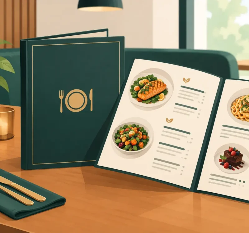
A guest has already made several decisions before they read a single menu item. They chose your location, stepped through the door, found a table, and formed a first impression. Restaurant menu design and printing now have one job: make ordering feel easy while giving people a reason to choose the items that support your business best.
That is more than making a menu look attractive. A hard-to-read, outdated, or poorly printed menu can make a good restaurant feel less polished than it is. A clear, professionally branded menu helps customers feel confident in what they are ordering, reinforces your personality, and keeps the experience moving when the dining room is busy.
For local restaurants, cafes, breweries, caterers, and takeout counters, the best menu is practical marketing. It should look like your business, hold up to daily use, and help guests find what they want without making them work for it.
Start With the Order You Want Customers to Make
A menu is not a complete inventory list. It is a sales tool built around real customer behavior. Most guests scan before they read. They look for familiar categories, price ranges, specials, dietary choices, and a few dishes that catch their attention right away.
That is why organization comes first. Put your most popular or most profitable categories where customers expect to find them. Use descriptive category labels that make sense to your guests. If your restaurant is known for crab cakes, wood-fired pizza, breakfast sandwiches, or vegan bowls, those signature offerings deserve a clear place on the page.
The goal is not to push every item equally. It is to guide a customer toward a satisfying order. A menu that gives equal visual weight to 70 items can feel overwhelming. A menu that creates a clear path through appetizers, entrees, add-ons, desserts, and drinks feels more welcoming.
Design for the pace of your restaurant
A full-service dining room, a fast-casual lunch spot, and a busy coffee counter need different menu systems. A seated restaurant may benefit from a multipage booklet or a refined single-sheet menu with room for descriptions. A quick-service business may need a large wall menu, a counter menu, and a takeout version that all use the same visual hierarchy.
There is no single correct format. The right choice depends on how many items you offer, how often pricing changes, whether guests order at the counter, and how much wear the menu will receive. Good design begins with those practical questions, not a trendy template.
Restaurant Menu Design and Printing Must Work Together
Design decisions and print choices affect each other. A beautiful layout can fail if the paper stock is too thin, colors print too dark, or the folds make key information hard to find. Likewise, durable materials will not fix cramped type, confusing sections, or inconsistent branding.
Planning both parts together helps avoid expensive reprints and last-minute compromises. Before production, consider how guests will physically use the menu. Will servers handle it at every table? Will it sit near condiments and spills? Will customers carry it outside or take it home? Is it a limited-time insert that changes every month?
For a casual restaurant with a stable menu, a heavier uncoated stock may offer a comfortable, approachable feel. For a menu that sees constant handling, lamination or a water-resistant finish can be worth the investment. For seasonal specials, smaller printed inserts may be more cost-effective than reprinting an entire menu. A high-end restaurant may choose textured paper and understated color, while a family-friendly spot may need strong contrast and easy-clean durability.
The best answer is rarely the most expensive option. It is the option that fits your brand, service style, budget, and replacement schedule.
Make Your Brand Easy to Recognize
Your menu should feel connected to everything else customers see: your storefront, signage, website, social media, loyalty cards, catering materials, and takeout packaging. When each piece looks unrelated, customers may not say so out loud, but they notice the inconsistency.
A strong menu uses your logo, colors, type styles, and photography with discipline. That does not mean putting the logo in every corner or filling the page with color. It means creating a recognizable look that supports the food rather than competing with it.
If your brand is neighborhood-focused and familiar, the menu might use warm colors, straightforward language, and clear item names. If your restaurant is positioned as upscale, the design may use more white space, restrained typography, and carefully written descriptions. Both can work. What matters is that the experience feels intentional.
Photography deserves special care. One excellent image can create appetite and give a signature dish visual importance. Ten mediocre photos can make a menu feel crowded and dated. If food photography is not available or the print format is small, well-chosen type, color, and spacing can do more for the menu than stock images ever will.
Readability Is Not Optional
Small type, low contrast, and dense descriptions are common menu problems because owners understandably want to fit more on the page. But if guests cannot read the menu comfortably in your actual dining-room lighting, it is not doing its job.
Choose a type size that works for a broad range of customers. Keep background colors and text colors far enough apart for easy reading. Avoid placing important information over photos or busy textures. Prices should be easy to locate without becoming the loudest thing on the page.
Descriptions need restraint, too. A few specific words can make an item sound memorable: house-smoked, local, crispy, herb-roasted, scratch-made. A long paragraph below every dish slows down the ordering process. Give customers enough information to decide, especially when ingredients, spice levels, or preparation methods matter, then let the food do the rest.
Clear dietary notation is also good service. If you offer vegetarian, vegan, gluten-free, nut-free, or dairy-free options, use a simple key and apply it consistently. Be accurate about what each notation means. For guests with allergies, clarity builds trust, but it should never replace a direct conversation with trained staff about kitchen procedures.
Build a Menu System, Not Just One Printed Piece
Customers may encounter your menu on a table, a wall, a website, a QR code, a catering packet, or a social media post. The details do not need to appear in exactly the same format everywhere, but the brand and core information should remain consistent.
A printed dine-in menu can focus on the experience at the table. A takeout menu may need hours, ordering instructions, catering information, and a clear callout for family meals. A digital menu should be easy to read on a phone, not simply a tiny copy of an oversized printed layout.
This is where a coordinated local design and production partner saves time. Instead of trying to match fonts, colors, pricing updates, and file versions across several vendors, you can manage the menu as part of a broader visual system. Catalyst Visuals helps businesses bring design, print production, and digital presentation together so the customer sees one polished brand at every touchpoint.
Plan for Changes Before You Go to Print
Prices change. Suppliers change. Seasonal items come and go. A menu design should anticipate that reality.
If your menu changes often, consider a format with replaceable inserts, a small number of easily revised panels, or a simplified core menu paired with a separate specials card. This approach can protect your budget and prevent staff from relying on handwritten corrections that weaken the look of the menu.
Before approving a final print run, review more than spelling and pricing. Check portion descriptions, allergens, phone numbers, business hours, online ordering details, and logo placement. Ask someone unfamiliar with the layout to find a few items quickly. If they hesitate, guests may hesitate too.
A printed proof is especially valuable when color, paper texture, folds, or lamination are involved. Screen colors can be misleading, and a small adjustment before the press run is far less costly than fixing thousands of finished menus.
A Menu Should Earn Its Place on the Table
Your food may be the reason guests return, but your menu shapes the decision that gets the plate to the table in the first place. It should look professional, feel easy to use, and reflect the care behind your kitchen.
If yours is crowded, inconsistent, worn out, or no longer reflects what your restaurant has become, that is a visible opportunity to improve. A smart redesign does not have to be complicated. Start with what guests need to find, what you need to sell, and what kind of experience you want people to remember. Then put a menu in their hands that makes choosing you feel like the easy call.